There’s value in trying your [dataviz] worst
In the past I’ve always asked students to create their best possible graphs in ggplot2 to practice creating clear, engaging data visualizations. Recently, I’ve realized value in adding a few early exercises that encourage students to make their worst.
Why is it good to make ggplot2 graphs so (intentionally) bad?
Here are four ways that creating a purposefully disgusting graph promotes learning and exploration in ggplot2:
- Making the worst graph encourages creativity while eliminating the stress of producing a perfect final visualization (unless, of course, it’s perfectly hideous)
- Making the worst graph requires extensive customization and code
- Making the worst graph means critically thinking about and identifying contributors to “bad” graphs
- Making the worst graph is surprisingly fun
I was recently inspired to try my absolute dataviz worst by a #tidytuesday prompt using data from Sarah Leo’s efforts to improve imperfect graphs in The Economist.
Instead of trying to recreate or further improve on their graphs, I decided to use my powers and energy for a much different purpose. A darker and more anarchistic purpose…
Behold, my worst!
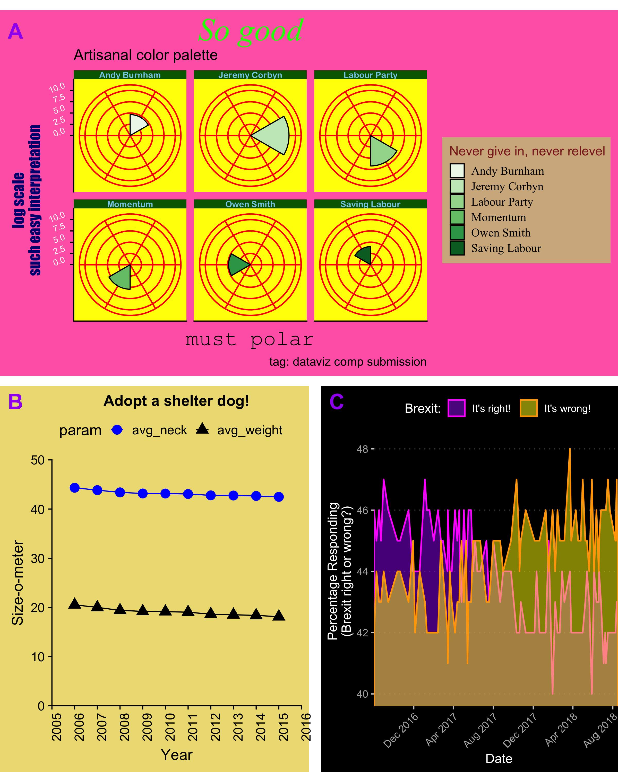
The undiscerning eye might think “these graphs are abominations and there was clearly no effort put into them.”
Wrong.
It’s a long dive from ggplot2 defaults into the depths of truly terrible DataViz, and it takes creativity and effort to keep sinking.
Here are just a few things I learned or re-learned during my nosedive:
- Arrange multiple graphs with cowplot by Claus O. Wilke
- Add figure labels and subtext
- Expand figure margins to let axis labels breathe
- Update fonts and colors in all graph components
- Convert to polar coordinates
- Customizing date formatting on axes
(click here for my complete worst dataviz code)
Through the process of trying my worst I learned some new customization skills, created useful reference code for future ggplot2 efforts, and had fun – it felt oddly liberating to be deliberately and creatively awful.
From now on, I’ll be adding a few early ggplot2 activities requiring students to do their absolute dataviz worst. There’s plenty of room at the bottom, and we can learn a lot and have fun on our way down.
Data visualization resources (in the other direction):
Fundamentals of Data Visualization by Claus Wilke
Data Visualization: a Practical Introduction by Kieran Healy