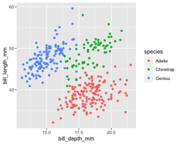
class: center, middle, inverse, title-slide # EDS 212 - Essential Math in Environmental Data Science ## Day 4 Part 2: Essential summary statistics and exploration --- ## Data types - **Quantitative:** numeric information - **Qualitative:** descriptions (usually words) ### A bit deeper: - **Continuous:** measured values, can take an of infinite possible values for a variable - **Discrete:** can only have certain values (e.g. counts) - **Ordinal:** order matters, but the difference between values isn't known or equal (e.g. Likert Scale) - **Binary:** only two possible outcomes (yes/no, true/false, 1/0) --- ## Nominal, ordinal, binary data: .center[ <img src="slide_images/data_types.jpeg" alt="drawing" width="80%"/> ] --- ## Quantitative data: continuous & discrete .center[ <img src="slide_images/quantitative_data.jpeg" alt="drawing" width="65%"/> ] --- ## Data distributions .center[ <img src="slide_images/party_histograms.jpeg" alt="drawing" width="90%"/> ] --- ## How can we describe how data are distributed? #### Our starting points: - Shape / patterns / clusters (data vizualization) - Central tendency (mean / median) - Spread & uncertainty (standard deviation / standard error / confidence interval) --- ## Useful data visualizations - Histograms - Boxplots - Scatterplots ...then get even more involved: - Beeswarm - Marginal plots - Raincloud plots - Pairs plots --- ## Histogram: a graph of the frequency of observations within a series of bins (usually of equal size) for a variable Example: distribution of penguin flipper lengths for chinstrap penguins <!-- --> --- ### Boxplot #### Most often: - Box extends to 1st and 3rd quartile observation values - Line at the median value - Whiskers extend to last observation within 1 step (1 step = 1.5*interquartile range) - Anything beyond whiskers indicated with a dot at the observation value --- ## Boxplot example: ```r teddy_miles <- c(1.0, 1.2, 1.8, 2.1, 2.4, 2.9, 3.4, 4.7, 5.1, 5.6, 7.8, 10.4, 15.4) teddy_miles <- data.frame(teddy_miles) ``` ```r ggplot(data = teddy_miles, aes(x = teddy_miles)) + geom_boxplot() ``` <img src="EDS_212_day-4-part-2-slides_files/figure-html/unnamed-chunk-4-1.png" style="display: block; margin: auto;" /> --- ### Scatterplots Always, always, always look at your data. It is the only way to make a responsible decision about an appropriate type of analysis. .center[ ```r ggplot(data = penguins, aes(x = bill_depth_mm, y = bill_length_mm)) + geom_point(aes(color = species)) ``` <!-- --> ] --- ### Summarizing data numerically - Central tendency - Variance and standard deviation - Standard error - Confidence interval --- ### Mean Average value of sample observations, calculated by summing all observation values and dividing by the number of observations - Pros: - Average value is often useful metric - Commonly reported - Cons: - Susceptible to outliers and skew - Subject to misinterpretation as "most likely value" --- ### Median Middle value when all observations are arranged in order - for n = even, the average of the middle two values. - Pros: - Less susceptible to skew and outliers - Better as sample size increases - Cons: - Doesn't take into account all values --- .center[ <img src="slide_images/central_tendency.jpg" alt="drawing" width="60%"/> ] Image: Sirkin, R. M. (2006). Measuring central tendency. In Statistics for the social sciences (pp. 83-126). SAGE Publications, Inc., https://www.doi.org/10.4135/9781412985987 --- class: center, middle ## The best way to describe the distribution of the data is to present the data itself. --- ## Variance and standard deviation Measures of **data spread**. - **Variance:** Mean squared distance of observations from the mean .center[ <img src="slide_images/variance_equation.png" alt="drawing" width="30%"/> ] Where `\(s^2\)` is the sample variance, `\(x_i\)` is a sample observation value, `\(\bar x\)` is the sample mean, and `\(n\)` is the number of observations. --- ## Standard deviation Also a measure of data spread, calculated by taking the square root of the variance. .center[ <img src="slide_images/standard_deviation.png" alt="drawing" width="30%"/> ] --- Beware summary statistics alone...meet the DINO DOZEN .center[ <img src="slide_images/dino_dozen.png" alt="drawing" width="70%"/> ] --- .center[ <img src="slide_images/gorilla.png" alt="drawing" width="50%"/> ] From: Yanai, I., Lercher, M. A hypothesis is a liability. Genome Biol 21, 231 (2020). https://doi.org/10.1186/s13059-020-02133-w --- ### Confidence interval **Confidence interval:** a range of values (based on a sample) that, if we were to take multiple samples from the population and calculate the confidence interval from each, would contain the true population parameter X percent of the time. **What it's NOT:** "There is a 95% chance that the true population parameter is between values X and Y." --- ### Confidence interval example Mean shark length is 8.42 `\(\pm\)` 3.55 ft (mean `\(\pm\)` standard deviation), with a 95% confidence interval of [6.45, 10.39 ft] (n = 15). What this **DOES NOT** mean: There is a 95% chance that the true population mean length is between 6.45 and 10.39 feet. What this **DOES** mean: 95% of calculated confidence intervals for samples drawn from this population will contain the true population parameter. This CI could be one of the 95%. It could also be one of the 5% that does *not* contain the true population parameter! --- ### Communicating data summaries - The "Bar bar plots" philosophy: show as much as you can for the audience you're presenting to - Summary statistics are often useful, but are a small part of the whole data story - Uncertainty is important! How can we responsibly communicate it? - All summaries are strongest when accompanied by additional data communication